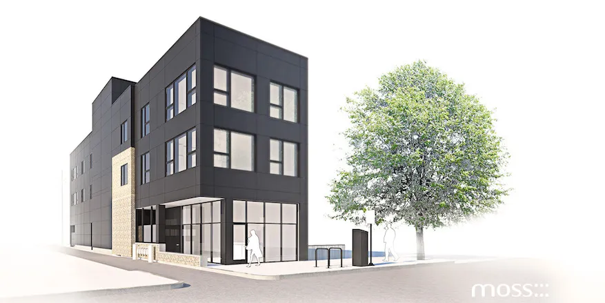
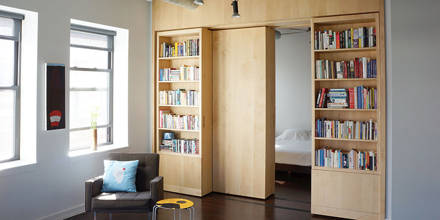
Two weeks ago we did the grand reveal for Uptown Family Vision‘s new storefront space in Park Ridge. We’re thrilled with the design of the space and hope that Dr. Jean Nham will be keeping Park Ridge in good eye health there for many years to come. In addition to designing the space, we helped create the brand identity for Uptown Family Vision, testing out a number of logo ideas before settling on the final design. Here’s how we did that.
Architecture: Designing the Building
You can read all about our design of the building remodel for Uptown here: COMING SOON: UPTOWN FAMILY VISION IN PARK RIDGE, the building process; UPTOWN FAMILY VISION: CONSTRUCTION PROGRESS REPORT, and the final space; UPTOWN FAMILY VISION IS NOW OPEN; NEW EYE DOCTOR AND GLASSES RETAIL SPACE FOR PARK RIDGE.
The design work for the whole space was not entirely separated from the identity design. When we started out the two went hand in hand as our design research explored the history of optometry and all the various graphic inspirations that might be drawn from it. This image is a collation of some of the precedents we accumulated as we began.

Identity: Designing the Brand
We brainstormed a number of logo ideas in sketch form, passing them back and forth between out design team and the Uptown Family Vision team in order to see what was resonating and what needed more work. Our starting points for logos and the front window design:

Once we’d addressed a number of possibilities in sketch, form we turned to the computer to generate more precise graphics and test out various font options. Here is how some of the sketches above translated into more refined logo designs below.

Choosing a Final Logo Design
As you can see, we had a lot of fun coming up with logos related to eyes, lenses, contact cases etc. In the end we decided to go in a different direction. We took our inspiration from the classic Ishihara colorblindness test. This test helps identify people with color vision problems (protanopia and deuteranopia) and assess the severity of their condition.
One of the original color plates is shown in the image below. To a color blind person (who can not see red) the different hues of the dots below disappear and only the different values show up. We enjoyed the reference to ophthalmic history and found it an attractive logo design.

Once we settled on the color vision test logo, we had to choose a set of colors which WOULD be visible everyone – the opposite purpose of the test. A little research gave us a range of possibilities which were aesthetically pleasing to us. We had them vetted by a color blind person to make sure they’d be properly inclusive and then Jean and Alex selected their favorite.

Here, the final choice – teal and green – is applied to a full range of Uptown paperwork.

Identity and the building
From there we translated the logo to the identity of the exterior signage. Here is the face-mounted sign and the design for the store windows, in sketch form and then as finally executed. The final logo design also appears inside the office space, below.


 As designers, we look for opportunities to create more than just buildings – we love to be involved in the full range of design outcomes for a new business space or for someone’s home. Uptown Family Vision gave us just that opportunity and we are very pleased with the result. Check out more of our identity work here.


