A few weeks ago, we posted about the idea of a nutrition label that focuses less on calories and carbs, and more on the journey of the food within. Below our concept, done in collaboration with UK artist narayan. Details inside.

A. Environmental Impact Rating: After some hemming and hawing, we decided to give our label a quantifiable rating, right at the top; an overall “environmental impact” measured from all of the information given, with the aim to label some items as being more detrimental than others.
The definition of “sustainably produced” has become a bit murky, admittedly, so in the interest of keeping things as straightforward as we could with such an endeavor, we imagined asking ourselves, along each step of production: could the product continue to be produced in this way, five, ten, twenty years from now with minimal adverse effects?
We didn’t want to assign value to decreased carbon emissions or the “naturalness” of a product, because we associate it with marketing and trends and we wanted our label to be mostly about providing information. But, in the end we decided a rating makes things easier for consumers, especially those who have already decided what kind of products they wanted to purchase, and, in this hypothetical grocery store of our dreams, they could quickly glance at something instead of taking twenty minutes to figure out if a juice box aligned with their values or not.
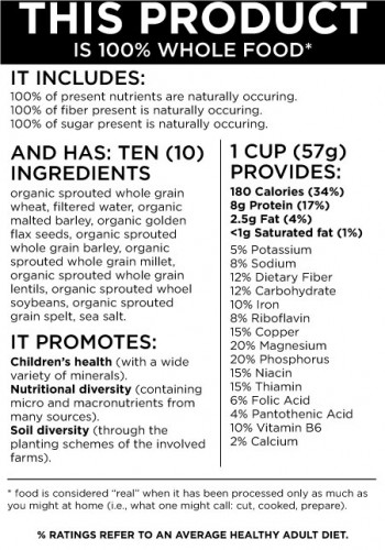
B. What: We kept the breakdown of elements that most labels provide, because people like to know those things, and frankly, we like to know them too. Sometimes a pie is just a pie, and sometimes it sends you spiraling into an early afternoon food coma due to 80 grams of sugar. We also:
- Added a label for High GI foods.
- We made the calories value smaller (textually, that is). Calories seem to be the obsession of dietitians and women’s magazines, and we don’t think it’s doing our nation’s food issues much good. Of bigger concern is what’s in our food and how it was made.
- We gave each ingredient its own row, for maximum impact, and added the variety, percentage, and whether it was genetically modified or not. It’s not always clear whether things are, unfortunately.
C. Where & Who: We added icons to break up the deluge of words; wouldn’t labels be a bit more appetizing to read if they were pretty? We want consumers to know where each ingredient came from, who was responsibile for it, and what farm it grew on. In the UK, produce is already stamped with variety, origin and farmer so perhaps this bit isn’t so farfetched.
D. When & How: It’s no secret that two things have been happening to supermarket produce (well, a lot of it) in the U.S.: it’s been getting bigger and tasting increasingly bland. Young tomatoes and olives, for example, are often picked before they are ripe, and sprayed with chemicals to ripen en route to shelves. We couldn’t think of a generalized way to sum up that sad, sad state of affairs, so we thought stamping a “harvested on (etc.)” date might be of use. We also added:
- The distance the item traveled.
- Whether it was by plane, train or automobile.
- The total carbon accrued during production/transport by ingredient.
- We also added examples of stamps for USDA certified organic, biodynamic farmed and fairtrade.
E. Packaging: it might be tough to standardize this for a single companies range of products, let alone an entire shelves worth of them, but we let ourselves pull out all the stops on our concept. Let us know what you think in the comments!